As years pass, it’s important for companies to rebrand to stay relevant with their consumers. Though 2021 has just begun, companies in the auto, fast food, sports, agency, and science industries have announced a change in their identity.
Kia
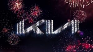
Kia’s rebrand incorporates a dynamic design to help shift focus to their new electric vehicles and “movement that inspires.” Their new logo, now used on vehicles currently in production and advertising materials, includes a sleeker italic typography. Kia announced their rebranding with an elaborate firework display in South Korea, setting a record, according to Guinness World Records, for most unmanned aerial vehicles (UAV) launching fireworks simultaneously.
Burger King
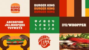
For the first time in 20 years, Burger King rebranded with branding materials from their past to create a more digital-friendly identity. A new color palette, graphics, and font are inspired by a retro theme that reflects Burger King’s core values and food. The rebrand will be used in all aspects of the company, including advertising, apparel, in-store experiences, and food packaging.
League Championship Series
As e-sports gained popularity, League Championship Series (LCS) marketed themselves as a traditional sports league with sponsor ads and pre- and post-game shows for participants. To stand out among other leagues, LCS announced a rebranded logo and two new taglines, “made by many” and “all for the game.” Their new logo adds a modern touch and the letters LCS are formed to form a diamond.
CIA
The CIA announced a digital rebrand to appeal to a more diverse recruiting pool of younger generations. Their updated website incorporates contemporary typefaces and graphics for a modern look, commonly seen in start-up tech agencies, design agencies, and the music industry. Headshots of different ethnicities are placed throughout webpages to include more diversity.
Pfizer
Pfizer made waves in 2020 as their COVID-19 vaccination was announced. As trials went through approval, their branding was going through a trial of its own. The original blue pill logo was replaced by double helix to signal their shift from commerce to science. Pfizer’s rebrand isn’t a result from the coronavirus; in fact, the logo itself took 18 months and 200 different designs to capture the essence of the company.
Sources: AdAge, AdWeek, Motor1, ESports.com, GRS Magazine
